IED (Istituto
Europeo del Design) is an international network of training centers in
the fields of Design, Fashion, Visual
Communication and Management.
IED periodically organizes
Open Days offering free educational activities that are
commonly performed during the academic year, so that guests have the opportunity
to attend the lessons that interest them.
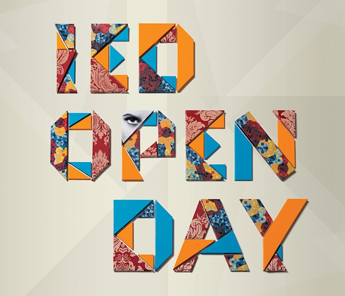
For the communication campaign of the Open Day
event, we wanted to manifest the diversity of the training offer, identifying
the four areas of Design, Fashion,
Visual Communication and Management.
Right from the start it was clear that we had to play with materials, we could
not limit ourselves to a nice illustration: fashion is made of cloth, photo of
paper, design of objects, etc. We therefore opted for a
three-dimensional lettering, to build, photograph and make hyper
realistic using postproduction. To learn more about this topic and to find many
sources of inspiration, I recommend you The 3D Type Book.
The idea was to build the letters in a kind of materic origami,
composed of elements of different types, different shape, different thicknesses
and made of different materials (remember the concept of multidisciplinary?).
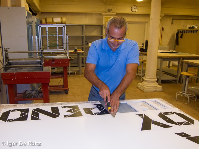
After having designed the individual letters we have printed them on paper,
carefully numbering the pieces (would have been a puzzle otherwise). The paper
sheets were then glued on rigid panels of different thickness and cut one by
one.
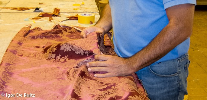
We have wrapped every single piece using a different material, carefully
following our design.
Did you like this article up to here?
Before you continue, follow us on our LinkedIn page pressing the button here below!
In this way, we'll be able to keep you updated on digital strategies not only with our posts, but also with the best articles that we collect around the web.
After having recreated the text (thanks to the numbering!), we glued it on a
panel and photographed it in studio.
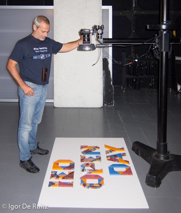
An intense photo editing was performed to
correct defects in materials, but not too much, because we wanted to make
explicit the fact that the words were real and not illustrated.
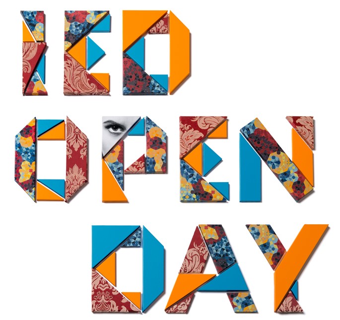
Finally the whole thing was stuck in
post-production on a background pattern specifically designed by Tommaso Cervone.
Did you like the development of this project?
Come to see all the images on Behance clicking on the button here below!
If you decide then to submit your appreciation to the project, you'll help us to to spread it over the network.